A sleek and playful brand identity that tactfully showcases a tasteful and diverse product line.
The Challenge
The Strategy
The Solution
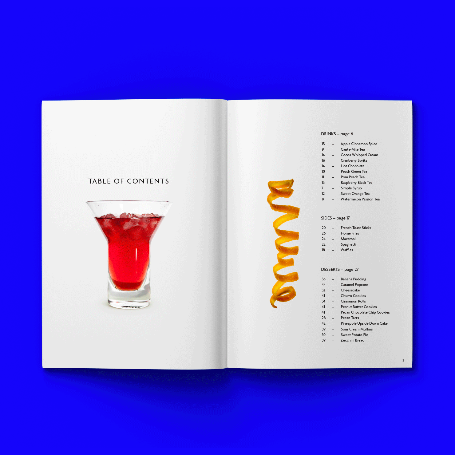
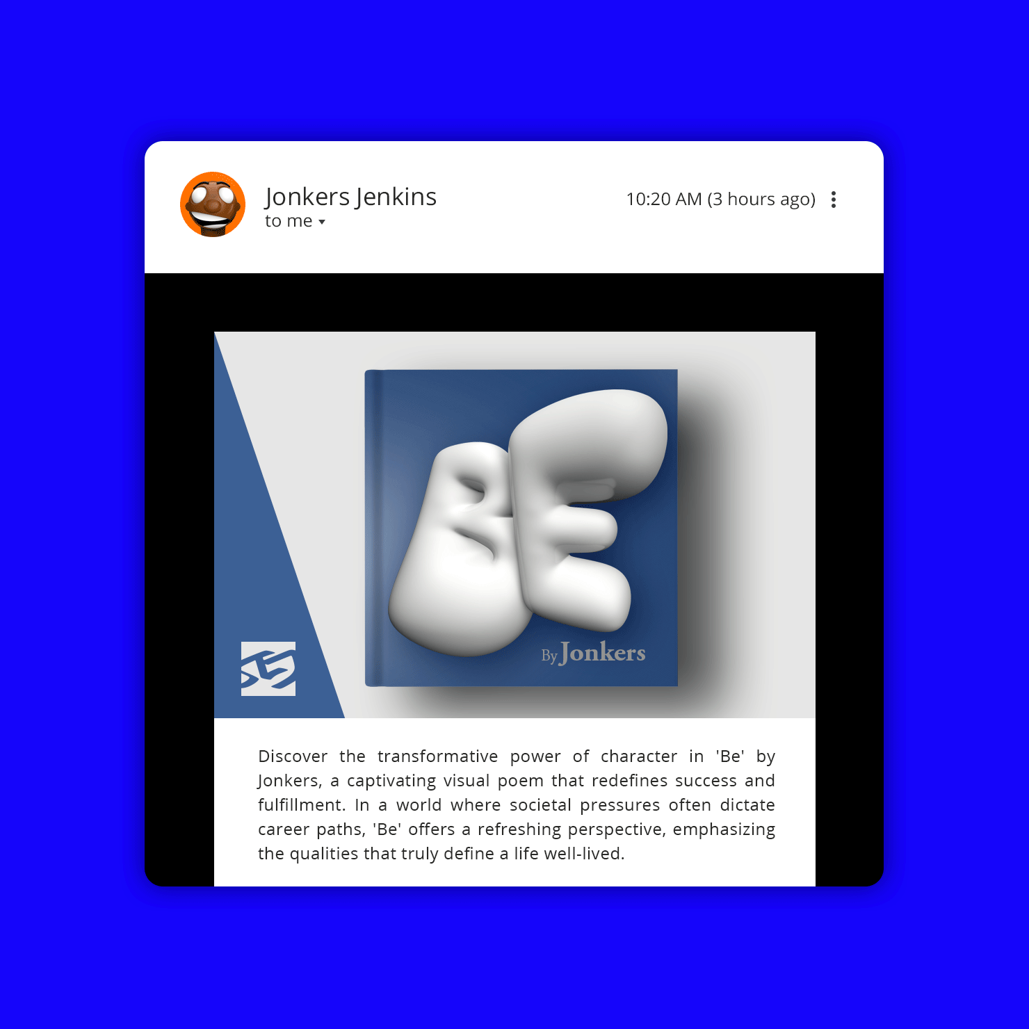
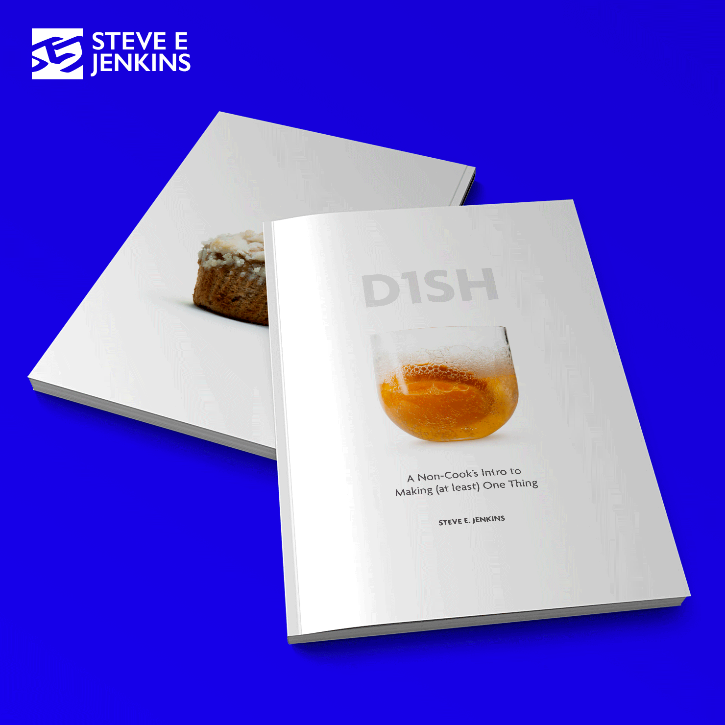
As an artist, designer, and all-around creative, Steve E. Jenkins has established himself as a visionary, technician, and strategist with a passion for tackling bold challenges. His portfolio spans an impressive range of creations, including children’s books like Be and Yes Mon, a recipe book titled D1SH, a comic and animated series featuring the robot K12, video game concepts DONK Battle Racing and Detroit Smash, as well as innovative designs of automobiles, electronics, and timepieces.
Brand Identity, Digital Design, Brand Strategy
With SEJ embodying such a multifaceted creative force, Jonkers Design set out to craft a cohesive brand identity and strategic position that would capture the essence of Steve’s design philosophy. This rebrand needed to unify SEJ’s diverse creations under one vibrant and engaging visual language, integrating the original SEJ logo while adding fresh energy and connectivity across all of the brand’s products.
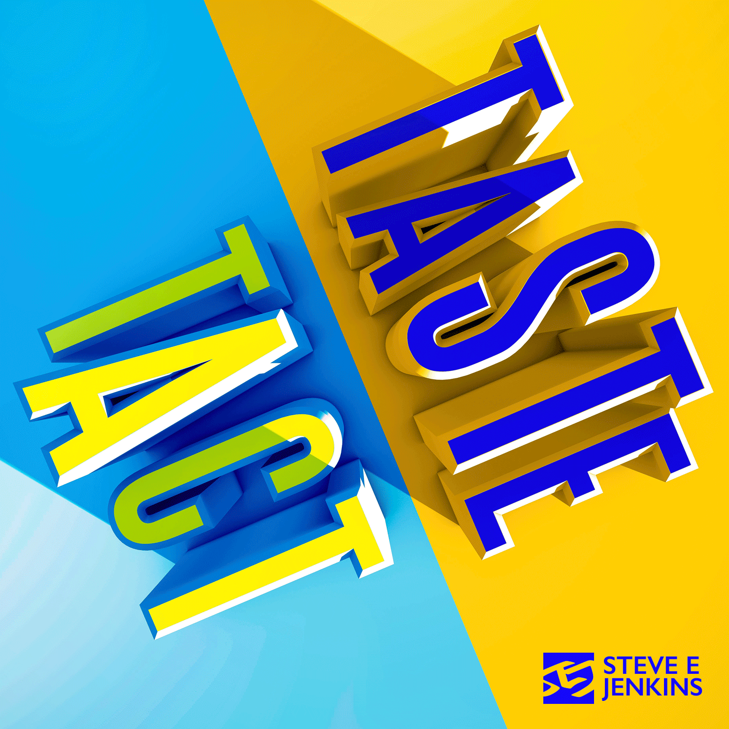
Jonkers Design developed the brand concept “Taste and Tact,” which reflects both the unique visual identity and the spirit that defines SEJ’s work. This phrase serves as the brand’s guiding principle, balancing dual ideals—experimental yet safe, uncompromising yet inviting, bold yet respectful, unapologetic yet thoughtful. This balance forms the foundation on which SEJ’s brand identity can thrive, now and into the future.
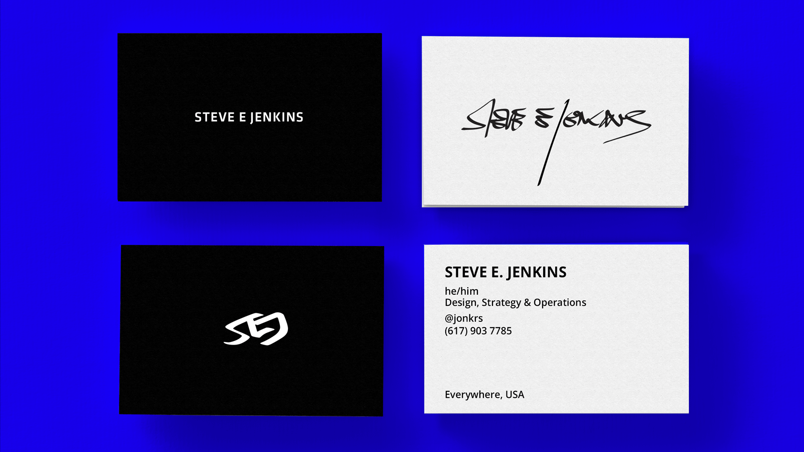
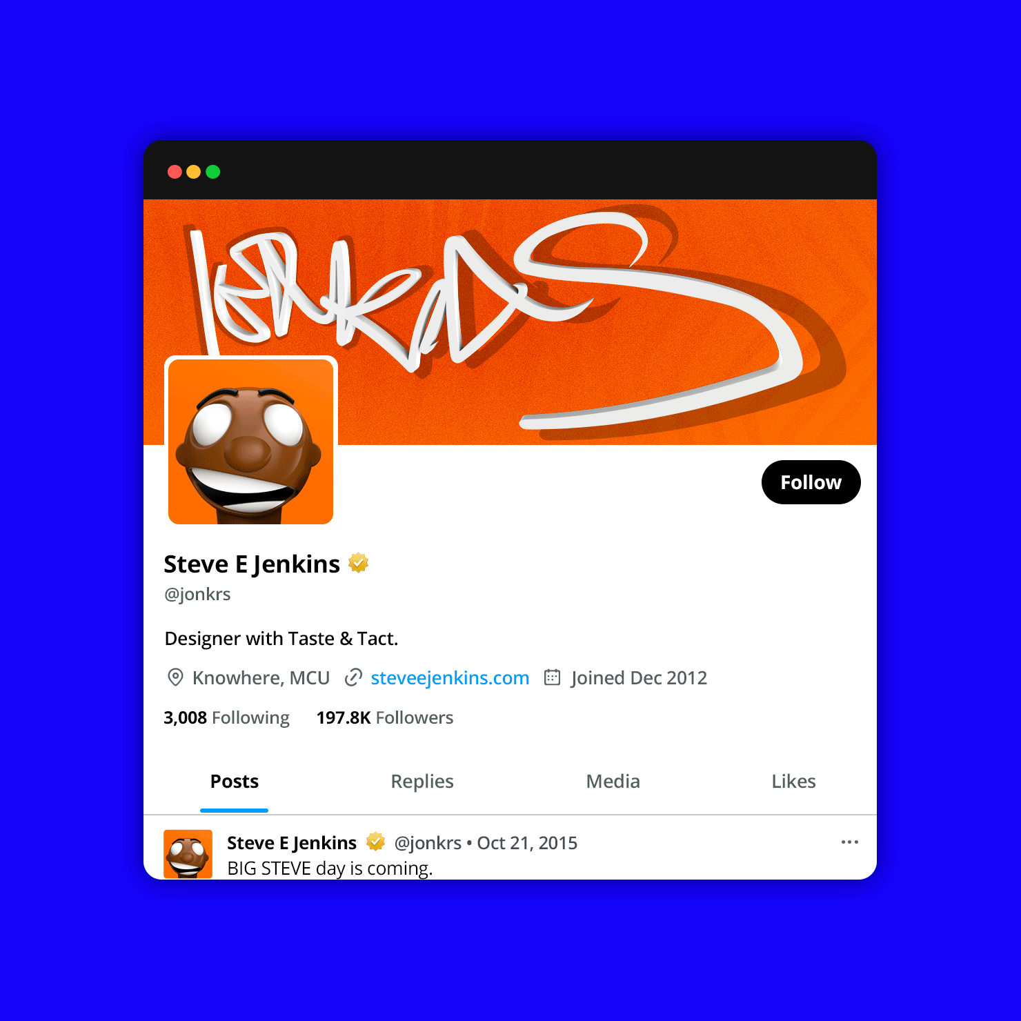
Guided by the “Taste and Tact” ethos, Jonkers Design introduced a lively, bold color palette to infuse the brand with a fresh vibrancy. A playful slash was incorporated as a unifying design element, adaptable across layouts with or without the logo. This refreshed style has been seamlessly applied across SEJ’s platforms, from print publications to social media.
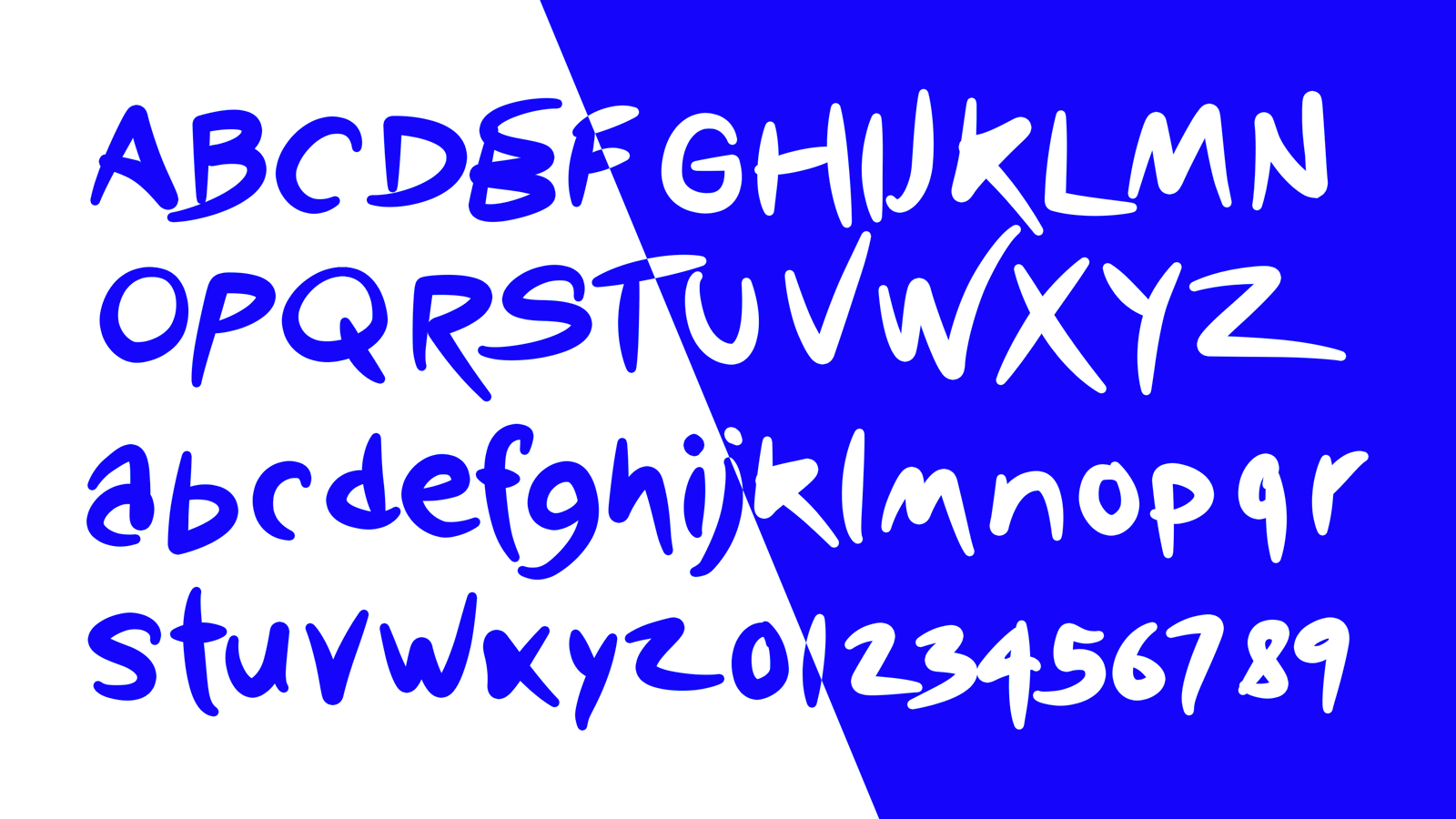
With elements like the dynamic slash, expressive handwriting, refined typography, and vibrant colors, SEJ’s brand identity now exudes high-quality craftsmanship paired with a spirited flair and thoughtful purpose. This revitalized visual language has harmoniously integrated the Steve E. Jenkins brand of products into one family that tactfully showcases his top-tier designs with taste.
As an artist, designer, and all-around creative, Steve E. Jenkins has established himself as a visionary, technician, and strategist with a passion for tackling bold challenges. His portfolio spans an impressive range of creations, including children’s books like Be and Yes Mon, a recipe book titled D1SH, a comic and animated series featuring the robot K12, video game concepts DONK Battle Racing and Detroit Smash, as well as innovative designs of automobiles, electronics, and timepieces.
With SEJ embodying such a multifaceted creative force, Jonkers Design set out to craft a cohesive brand identity and strategic position that would capture the essence of Steve’s design philosophy. This rebrand needed to unify SEJ’s diverse creations under one vibrant and engaging visual language, integrating the original SEJ logo while adding fresh energy and connectivity across all of the brand’s products.
Jonkers Design developed the brand concept “Taste and Tact,” which reflects both the unique visual identity and the spirit that defines SEJ’s work. This phrase serves as the brand’s guiding principle, balancing dual ideals—experimental yet safe, uncompromising yet inviting, bold yet respectful, unapologetic yet thoughtful. This balance forms the foundation on which SEJ’s brand identity can thrive, now and into the future.
Guided by the “Taste and Tact” ethos, Jonkers Design introduced a lively, bold color palette to infuse the brand with a fresh vibrancy. A playful slash was incorporated as a unifying design element, adaptable across layouts with or without the logo. This refreshed style has been seamlessly applied across SEJ’s platforms, from print publications to social media.
With elements like the dynamic slash, expressive handwriting, refined typography, and vibrant colors, SEJ’s brand identity now exudes high-quality craftsmanship paired with a spirited flair and thoughtful purpose. This revitalized visual language has harmoniously integrated the Steve E. Jenkins brand of products into one family that tactfully showcases his top-tier designs with taste.
A sleek and playful brand identity that tactfully showcases a tasteful and diverse product line.
Steve E. Jenkins
Brand Identity, Digital Design, Brand Strategy
SEJ (Steve E. Jenkins)
Steve E. Jenkins
As an artist, designer, and all-around creative, Steve E. Jenkins has established himself as a visionary, technician, and strategist with a passion for tackling bold challenges. His portfolio spans an impressive range of creations, including children’s books like Be and Yes Mon, a recipe book titled D1SH, a comic and animated series featuring the robot K12, video game concepts DONK Battle Racing and Detroit Smash, as well as innovative designs of automobiles, electronics, and timepieces.
The Challenge
With SEJ embodying such a multifaceted creative force, Jonkers Design set out to craft a cohesive brand identity and strategic position that would capture the essence of Steve’s design philosophy. This rebrand needed to unify SEJ’s diverse creations under one vibrant and engaging visual language, integrating the original SEJ logo while adding fresh energy and connectivity across all of the brand’s products.
The Strategy
Jonkers Design developed the brand concept “Taste and Tact,” which reflects both the unique visual identity and the spirit that defines SEJ’s work. This phrase serves as the brand’s guiding principle, balancing dual ideals—experimental yet safe, uncompromising yet inviting, bold yet respectful, unapologetic yet thoughtful. This balance forms the foundation on which SEJ’s brand identity can thrive, now and into the future.
The Solution
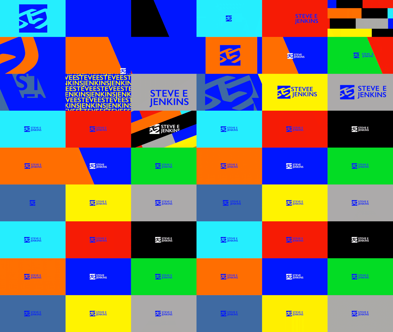
Guided by the “Taste and Tact” ethos, Jonkers Design introduced a lively, bold color palette to infuse the brand with a fresh vibrancy. A playful slash was incorporated as a unifying design element, adaptable across layouts with or without the logo. This refreshed style has been seamlessly applied across SEJ’s platforms, from print publications to social media.
With elements like the dynamic slash, expressive handwriting, refined typography, and vibrant colors, SEJ’s brand identity now exudes high-quality craftsmanship paired with a spirited flair and thoughtful purpose. This revitalized visual language has harmoniously integrated the Steve E. Jenkins brand of products into one family that tactfully showcases his top-tier designs with taste.